Full-Screen Media Viewing Experience
This project focused on designing a full-screen media-viewing experience for a social platform. When users tapped media content from the feed, they entered an immersive full-screen view that allowed them to focus on the content while still accessing post context and interactions when needed.
I was responsible for designing the full-screen viewing experience, including content hierarchy, interaction patterns, and contextual controls, while keeping the scope intentionally limited to viewing not feed or creation flows.
My Role
Product Designer
I led the end-to-end experience design for the full-screen media view, including:
Content hierarchy and layout
Gesture and tap-based interactions
Interaction affordances for post engagement
Alignment with existing interaction patterns on the platform
ScopeTeam
1PM · 2 Engineers · 1 QA
Timeline
2023
Problem
Media content is central to engagement, but within the feed it often felt constrained by layout and surrounding noise. Users wanted to focus on images and videos without losing access to post context or social interactions.
The challenge was to design a full-screen experience that:
Prioritized media immersion
Allowed users to access post content and interactions on demand
Avoided overwhelming the screen with persistent UI
Felt natural and intuitive without onboarding
Goals & Success Criteria
The goals of this project were to:
Create an immersive full-screen media experience
Keep post context and interactions accessible but secondary
Support intuitive, gesture-driven interactions
Maintain clarity even for long post content
Success was defined by:
Users being able to focus on media without distraction
Clear discoverability of post text and interactions
Smooth navigation without cognitive overload
Constraints & Context
Mobile-first only
Media included both images and videos
Posts could contain long-form text
The experience needed to support interaction without shifting focus away from content
Scope was limited strictly to the full-screen viewing experience
Key Design Decisions
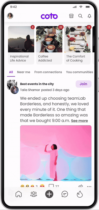
1. Use a single tap to reveal post content
A single tap on the full-screen media reveals the post text. When the text is long, it becomes scrollable within the same context.
Why:
This kept the default state focused on media while allowing users to access written context only when they chose to.
2. Keep creator context visible but lightweight
A single tap on the full-screen media reveals the post text. When the text is long, it becomes scrollable within the same context.
Why:
This kept the default state focused on media while allowing users to access written context only when they chose to.
3. Make interactions accessible, not dominant
Users can:
Send reactions
View and write comments
See existing reactions and comments
Share the post
Report the post via a three-dot menu
All interactions are placed in the lower area of the screen and visually secondary to the media.
Why:
Engagement actions should be available at the moment of intent, but never compete with the content itself.
The final full-screen experience:
Opens media into an immersive, distraction-free view
Uses tap and scroll interactions to reveal post text naturally
Maintains lightweight creator and community context in the header
Supports engagement actions without breaking immersion
The experience feels focused by default, with layers of information revealed progressively based on user intent.
Solution
Outcome
Users could engage more deeply with media content while still accessing post details and social interactions when needed. The full-screen experience felt intuitive and required no explanation, supporting both passive viewing and active engagement.
What I Learned
This project reinforced the importance of progressive disclosure in content-heavy experiences. By defaulting to focus and revealing context only when requested, the design protects user attention while still supporting rich interaction.